HUSH CANNABIS BRAND
BRANDING • IDENTITY DESIGN • PACKAGE DESIGN
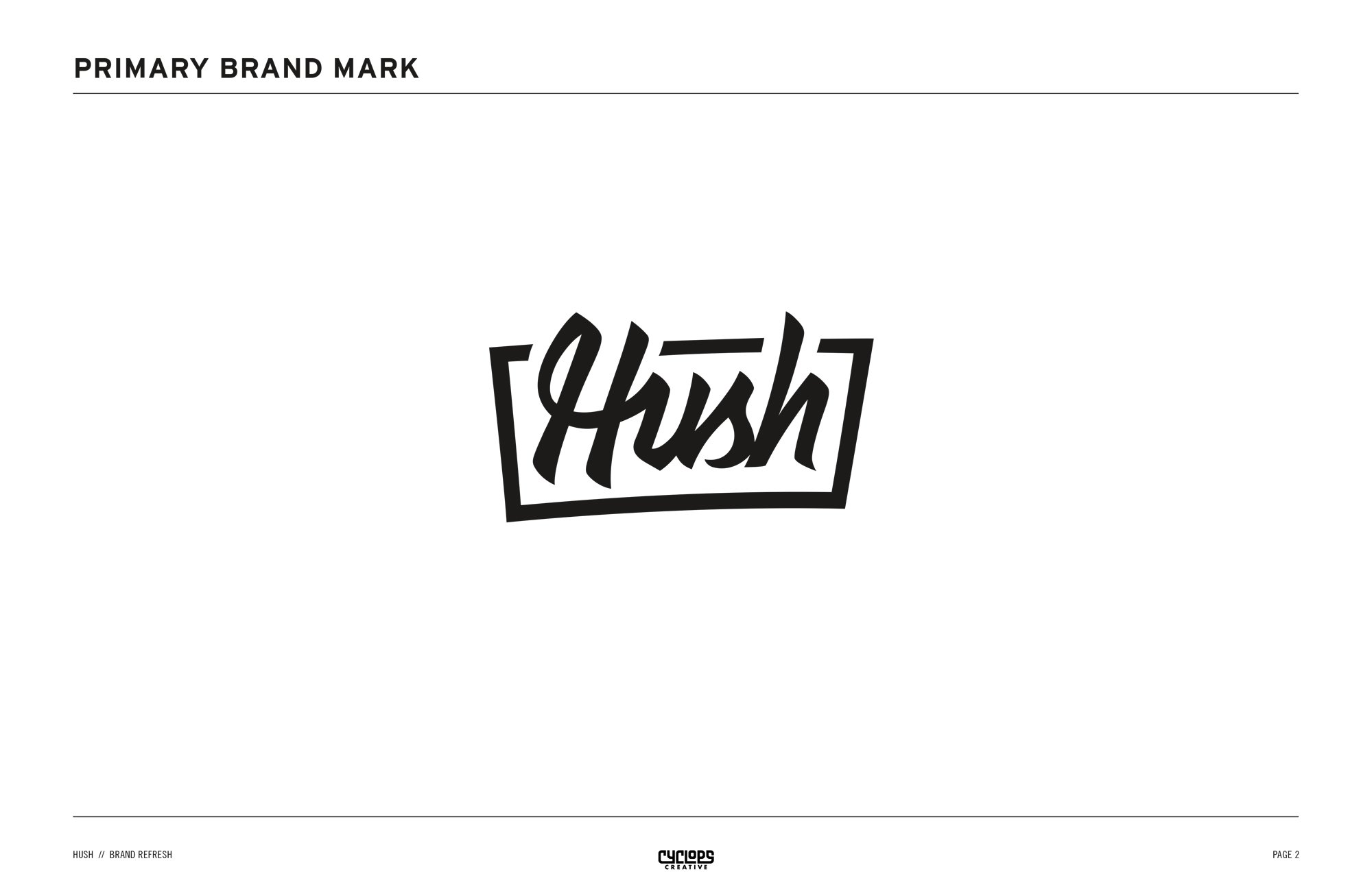
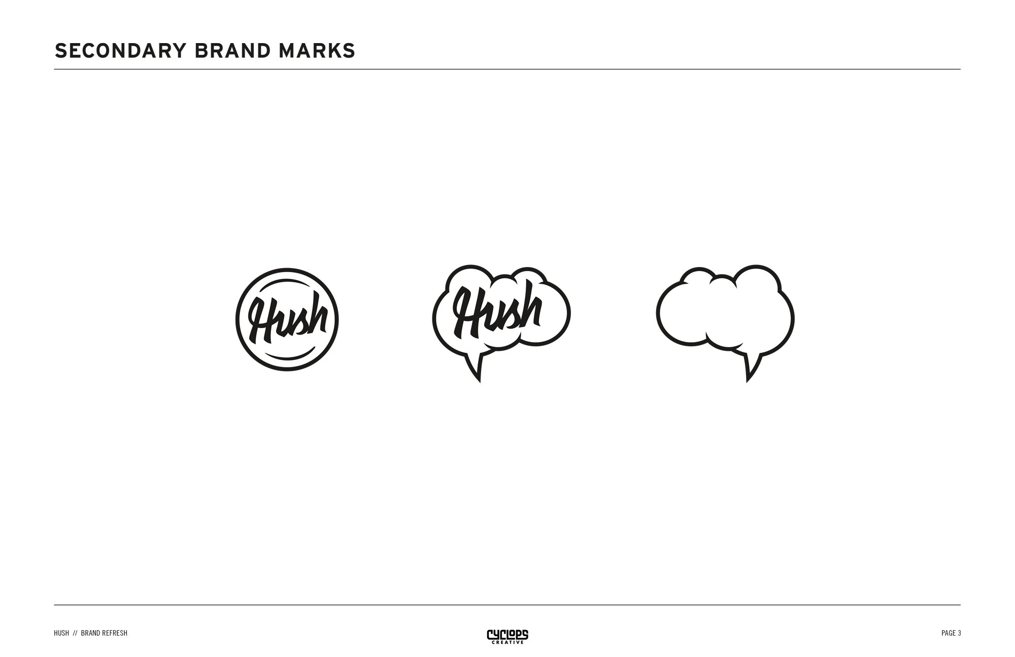
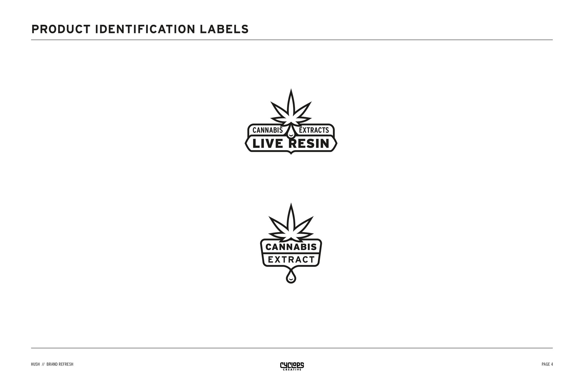
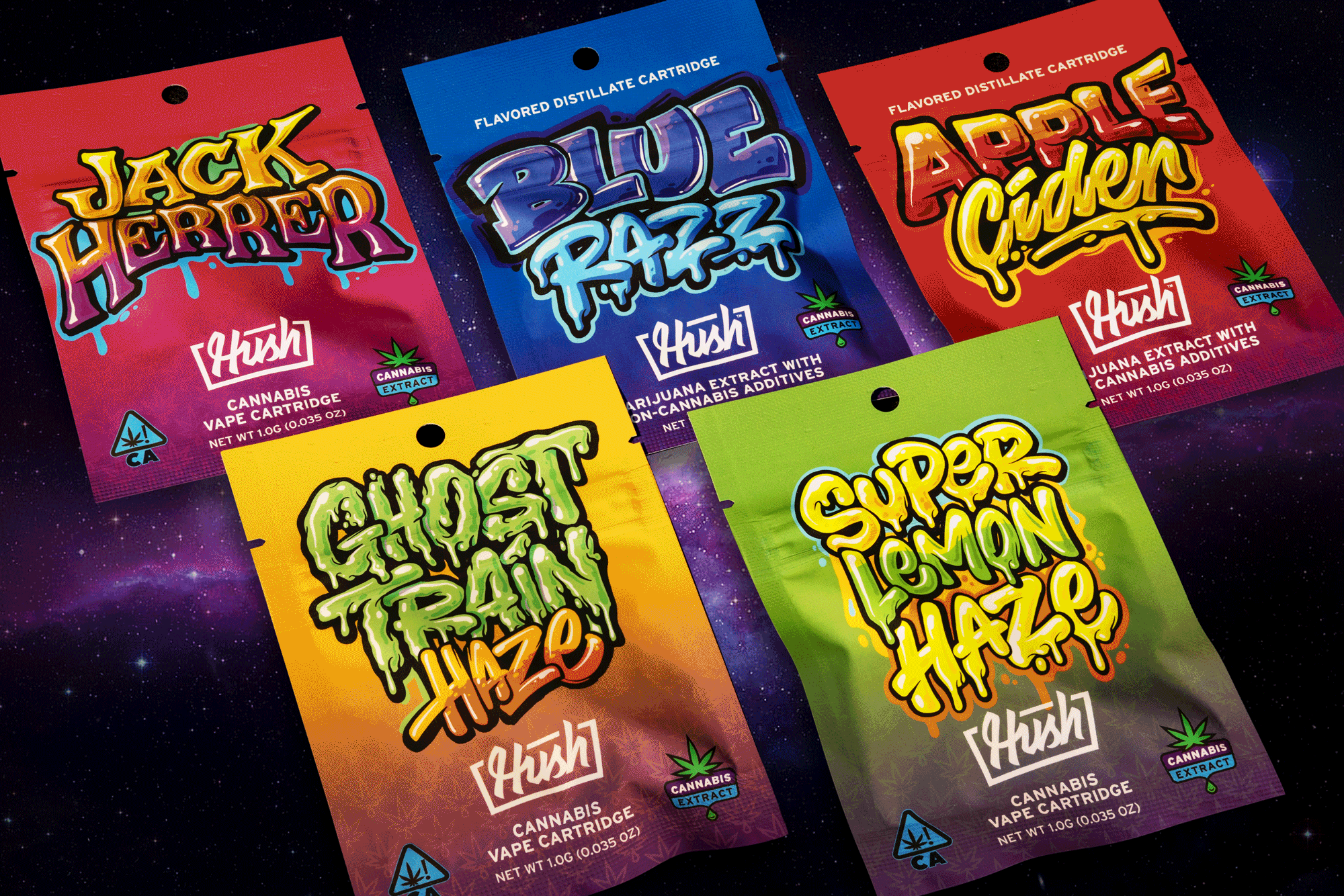
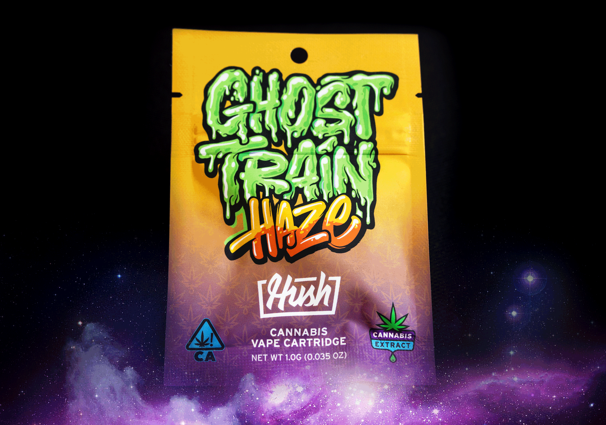
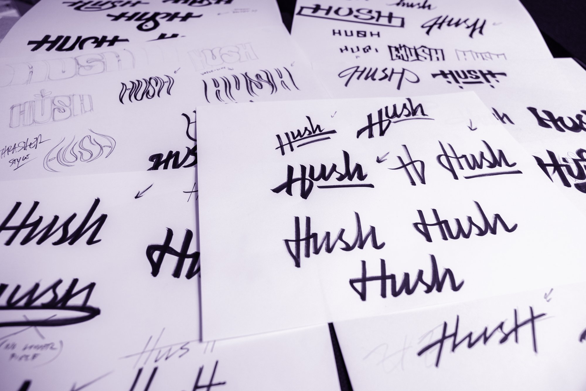
The folks at Hush decided their brand was getting a little dusty and needed a refresh. I was given a near blank slate to develop new logos, secondary graphic assets, hand-lettered taglines, package design, and color and type executions. The artwork for each strain was the one prerequisite that had to be incorporated into the new look. The project went from ideas and concept sketches on paper to printed packaging, retail locations and merch in just a few months, and helped bring the fledgling brand into the mainstream.
“High Quality, Quality High”
Check ‘em out: @hushcannabrand
Additional Credits:
The unknown artist that did the art for each of the strains—whoever you are, right on!

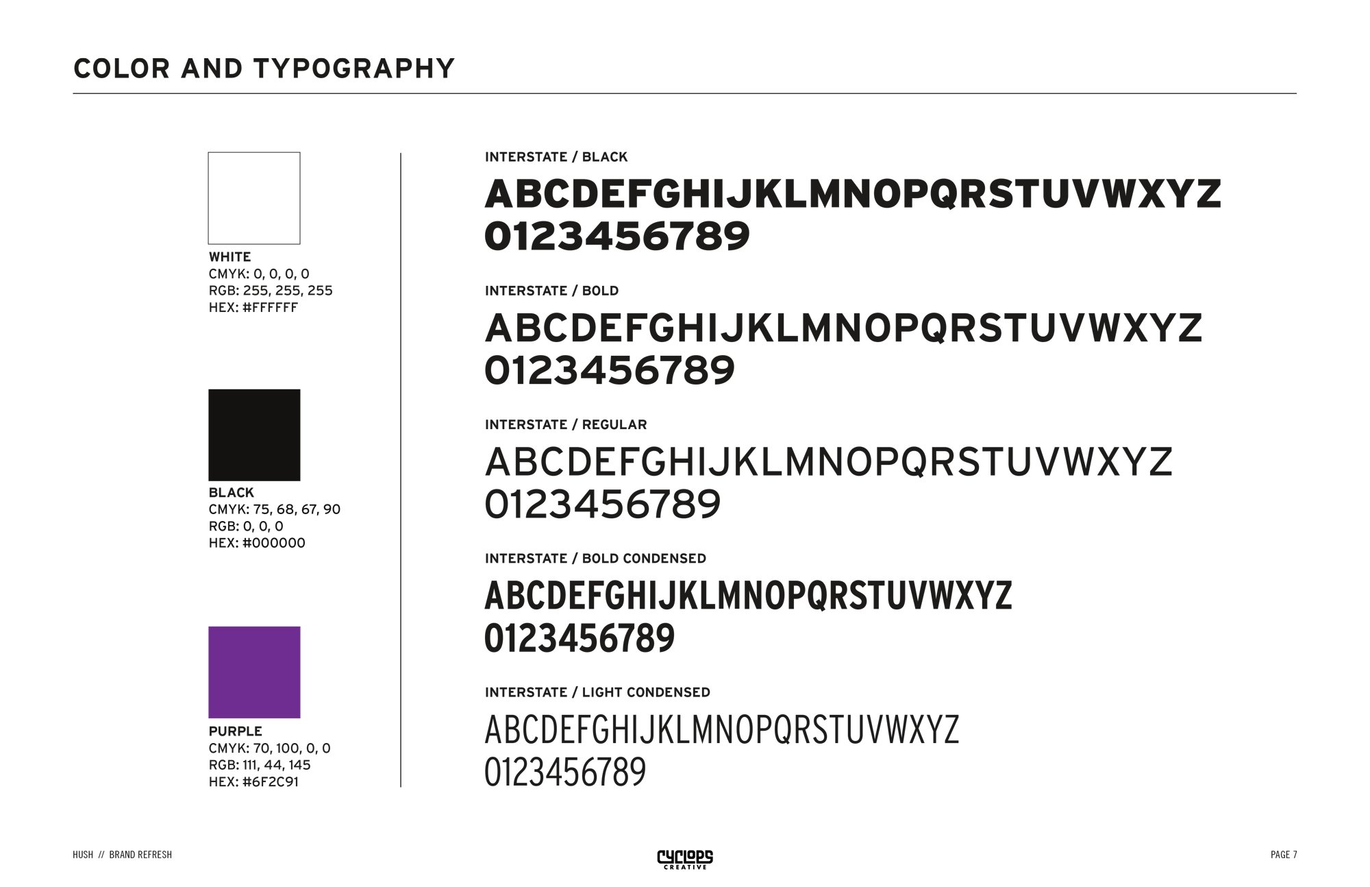
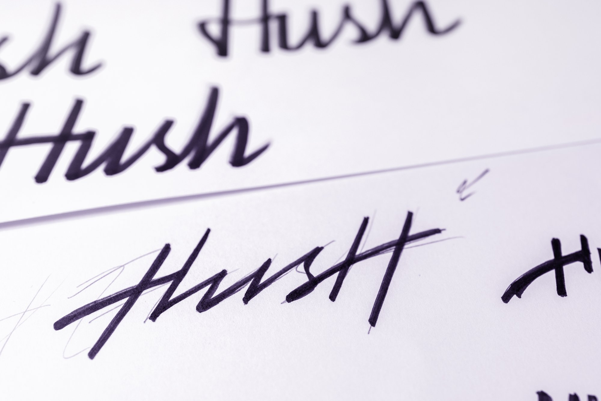
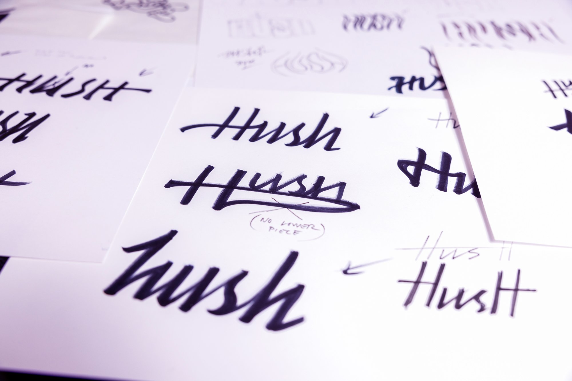
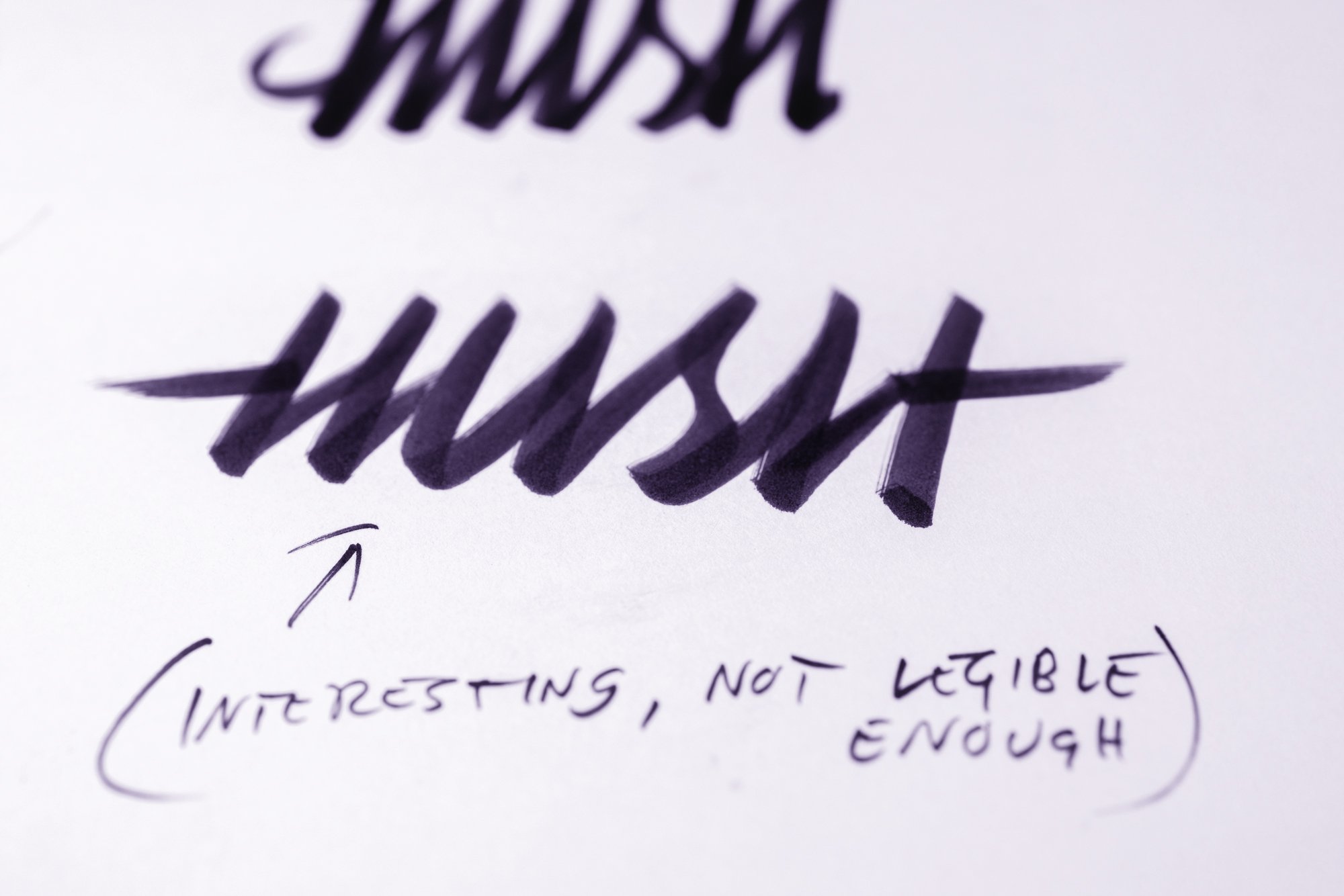
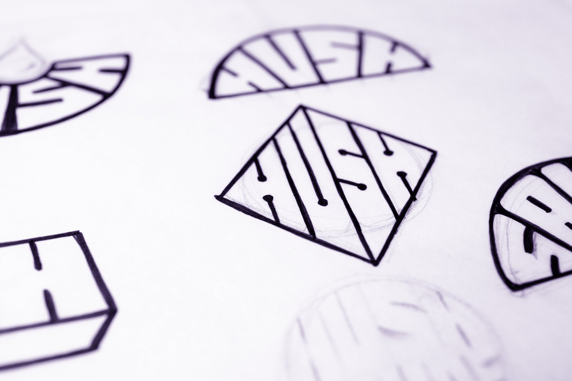
HUSH BRAND STUDY
FROM HERE TO THERE
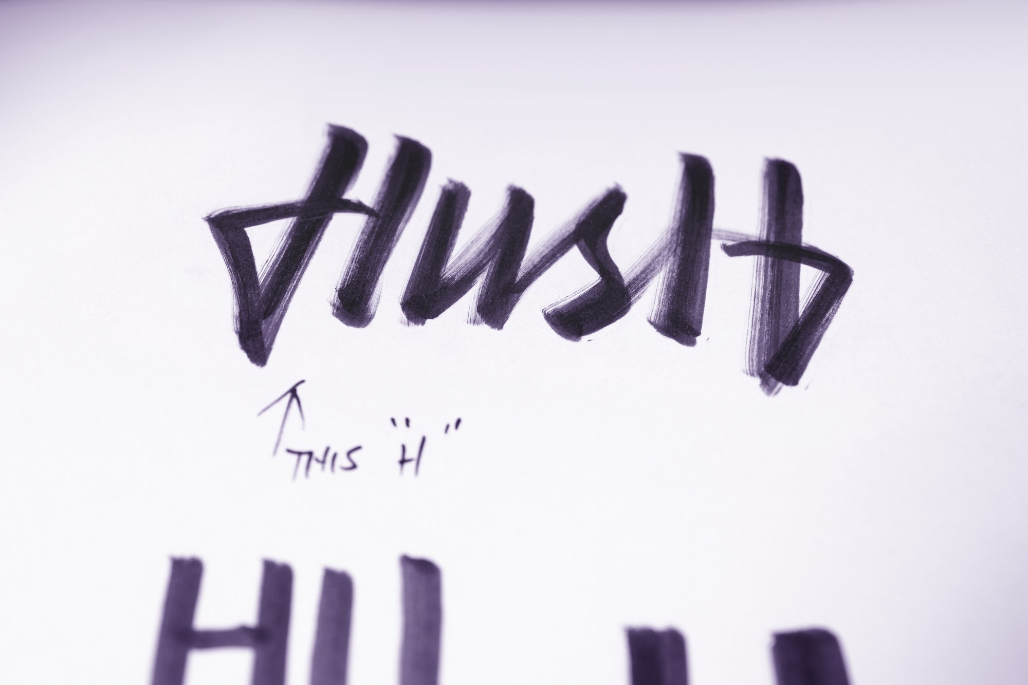
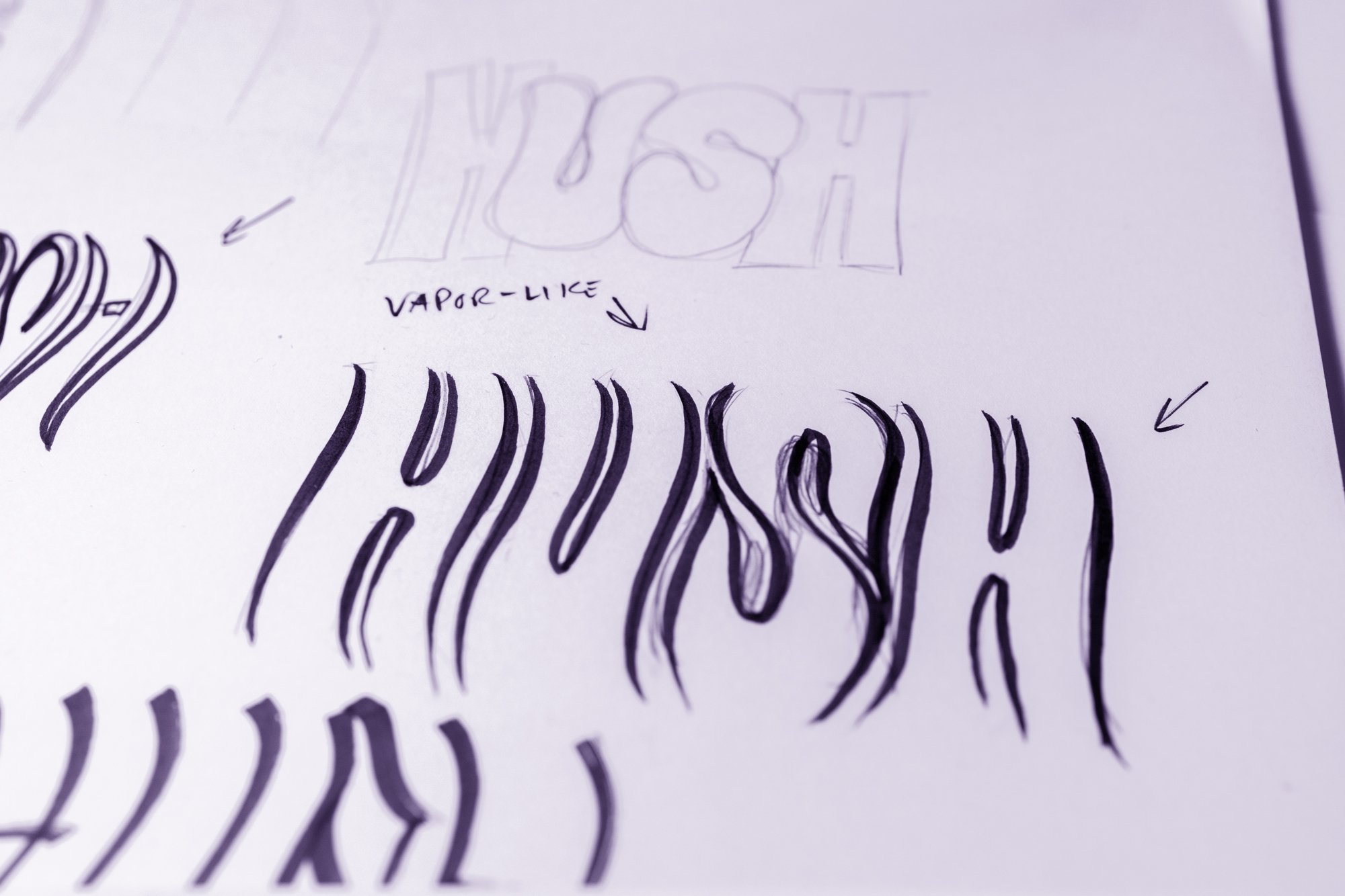
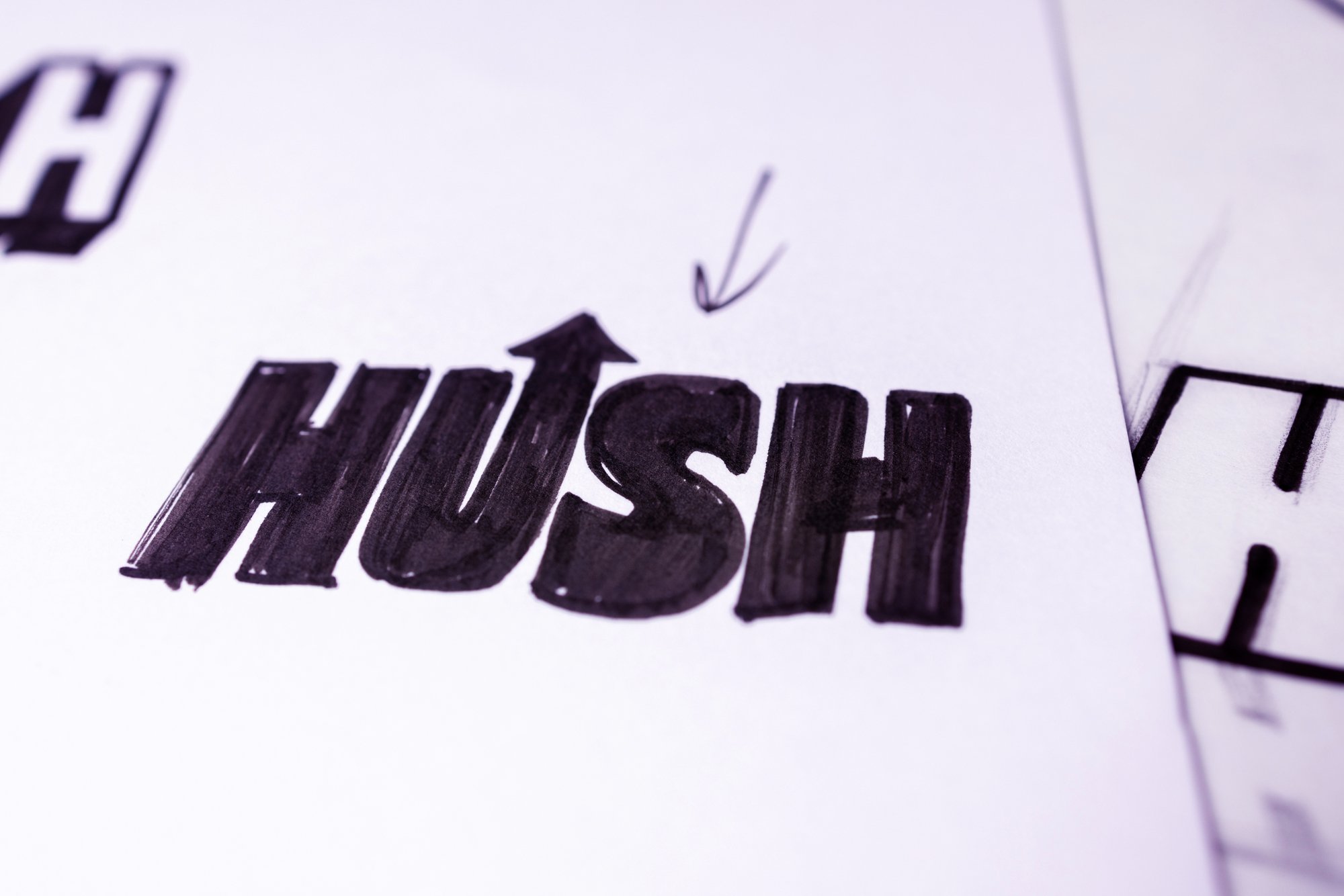
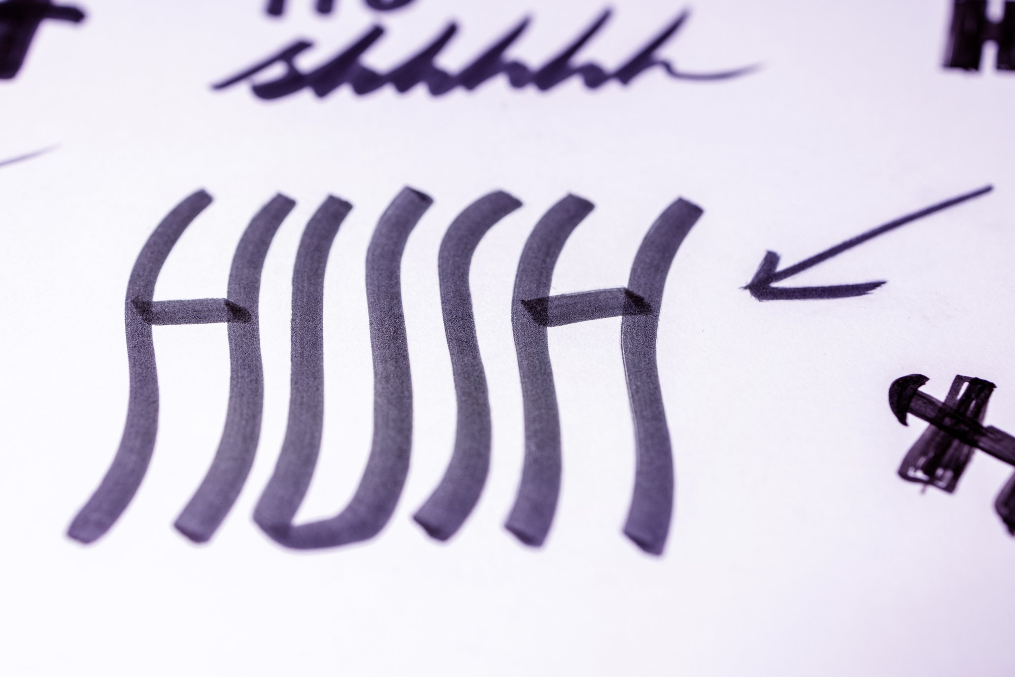
It’s who you know, ya know? Got a call from a friend who is friends with a friend, and they needed to refresh a little cannabis company’s brand—and can I help? Pencil to paper, scribble ideas and concept sketches, then to the scanner, digitize and facsimilize; clean up, tweak, adjust… logos are done, man.
GETTING RESULTS
When said and done, Hush received a fresh identity system, new packaging, brand colors and type, and a guideline to help move their brand forward. The goal was to create a cohesive look and feel across their entire product line, enhance brand recognition in the retail setting and just plain look cool. You be the judge—head to your local dispensary and find out what the Hush brand is all about.